Special Chat Types
Aisle supports special rendering types that allow AI models to display rich, interactive content beyond plain text. These special types are enabled by default on most model chats and can be requested in conversations or used directly in prompts.
Overview
Special chat types are special entities that you can instruct the LLM to render. They enable:
- Visual diagrams - Flowcharts, sequence diagrams, and more with Mermaid
- Interactive charts - Line, bar, area, and pie charts for data visualization
- Formatted prompts - Structured prompt blocks with action buttons and diff views
These rendering types are available in:
- Model chats - Enabled by default, just ask the AI to use them
- Prompts - Include the syntax directly in your prompt templates
- Projects - Use through project chats and project-assigned prompts
Mermaid Diagrams
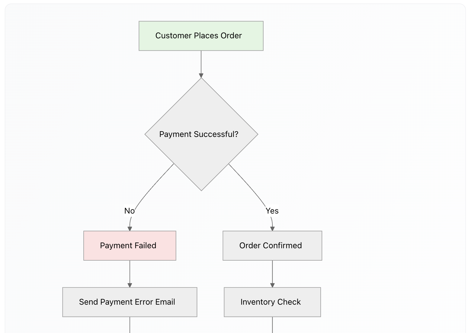
Render flowcharts, sequence diagrams, Gantt charts, and other diagram types using Mermaid syntax.
Usage
Simply ask the AI to create a diagram, or include Mermaid code blocks in your prompts:
```mermaid
graph TD
    A[Start] --> B[Process]
    B --> C{Decision}
    C -->|Yes| D[End]
    C -->|No| B
```
Supported Diagram Types
- Flowcharts -
graph TDorgraph LRfor top-down or left-right layouts - Sequence diagrams -
sequenceDiagramfor interaction flows - Gantt charts -
ganttfor project timelines - Class diagrams -
classDiagramfor object-oriented structures - State diagrams -
stateDiagram-v2for state machines - And more - Full Mermaid syntax is supported
Features
- Streaming support - Diagrams show a loading skeleton while being generated
- Scrollable - Wide diagrams scroll horizontally rather than being cut off
- Standard syntax - Uses official Mermaid syntax, no custom extensions needed
Graphs and Charts
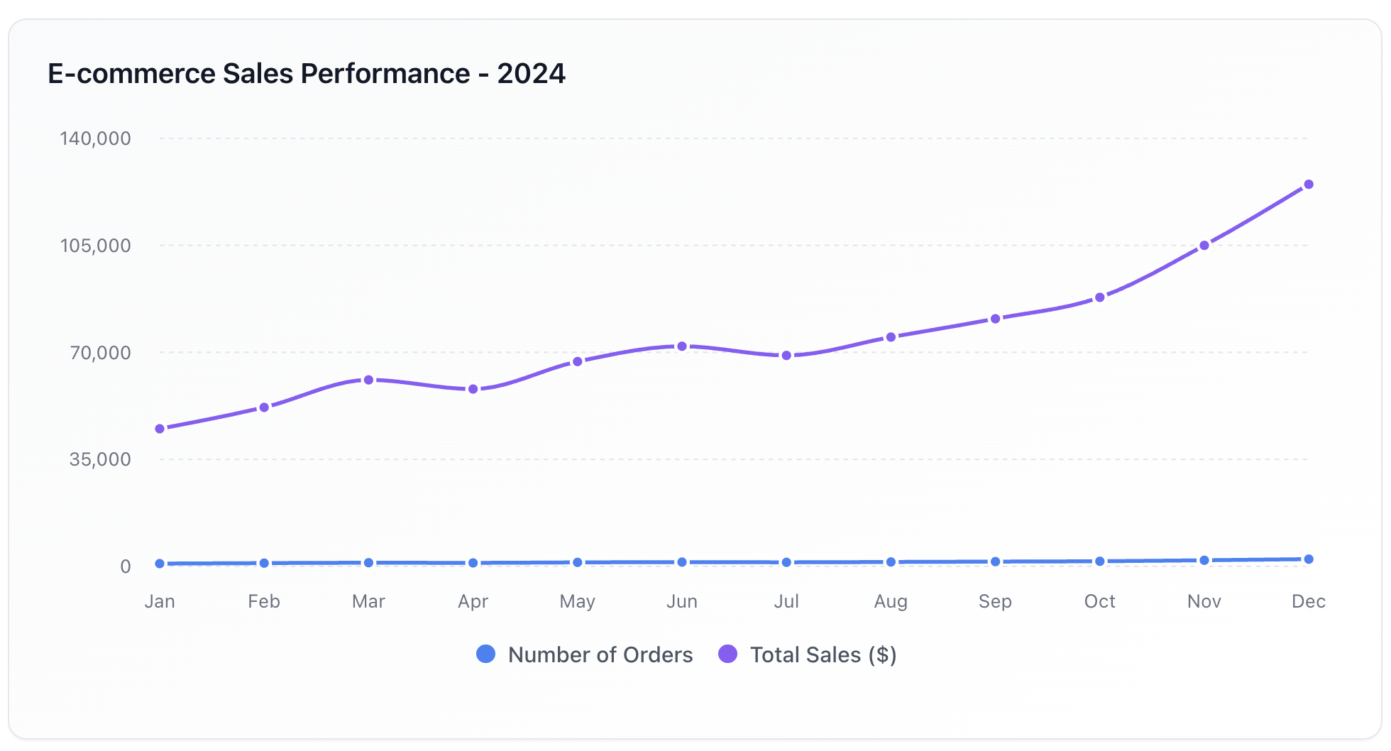
Charts are declared in an aisle-chart fenced code block. One JSON object per block, with the
chart type in a kind field.
Syntax
```aisle-chart
{
  "kind": "line",
  "title": "Monthly Sales and Revenue",
  "data": [
    { "month": "Jan", "sales": 100, "revenue": 5000 },
    { "month": "Feb", "sales": 150, "revenue": 7500 },
    { "month": "Mar", "sales": 200, "revenue": 10000 }
  ],
  "x": { "dataKey": "month", "label": "Month" },
  "y": [{ "label": "USD" }],
  "series": [
    { "dataKey": "sales", "name": "Sales" },
    { "dataKey": "revenue", "name": "Revenue" }
  ]
}
```
Only kind, data and series are required. Everything else has a default.
Core fields
| Field | Purpose |
|---|---|
kind | line, bar, area or pie |
data | Array of row objects, one per data point |
series | [{ dataKey, name }] — one entry per measure plotted |
x | { dataKey, label } — the category axis |
y | [{ label, domain }] — the value axis. Set label to the unit |
title / subtitle | Heading, and a line beneath it for a caveat |
layout | Bar charts only: vertical (default) or horizontal |
A series entry can set type to line, bar or area to override kind, which is how a bar
and a line share one chart. For a pie, x.dataKey names each slice and the first series entry
holds the values.
Axis scaling
y[0].domain accepts "zero", "auto", or an explicit [min, max]. The default is "zero" for
bar charts — a bar's length is the quantity, so truncating its axis overstates differences — and
"auto" for line and area charts, which pads the data range instead of squashing the series into
a sliver at the top.
Charts have one value axis. Two measures in different units are shown as two charts, or by indexing both to a common base. Two y-scales are not supported: the crossover point and the apparent correlation would be artefacts of two arbitrary scale choices.
Grouped and stacked bars
Several series entries over the same categories render side by side. Give two or more the same
stackId to stack them instead — appropriate when the parts sum to a meaningful whole, such as
revenue by segment.
Colour
Colours are assigned automatically from a validated house palette, in series order. You do not normally set them.
Two rules colour individual data points by meaning rather than by series. Both go inside the
series entry, alongside dataKey:
"colorBy": { "rule": "sign" }— positive, negative and zero values get distinct colours. Useful for cash flow, net change, or year-on-year growth."colorBy": { "rule": "topN", "n": 3 }— the highest n values keep full colour and the rest recede. Useful for rankings.
A reference series such as a five-year average takes "color": "role:neutral" and
"dashed": true, so it reads as a benchmark rather than a competing series.
Annotations
annotations adds marks that comment on the plot. In every annotation, axis: "y" means the value
axis and axis: "x" the category axis, whichever direction the bars run.
"annotations": [
  { "type": "line",  "axis": "y", "value": 0, "label": "Breakeven" },
  { "type": "band",  "axis": "x", "from": "Q2", "to": "Q3", "label": "Outage" },
  { "type": "delta", "between": ["actual", "avg"], "label": "Surplus to average" },
  { "type": "point", "x": "Jul", "y": 9650, "label": "Peak" }
]
delta shades the gap between two plotted series, and adds a legend entry when it carries a
label. An annotation whose coordinate does not fall on an axis of the chart is ignored, and the
chart still renders.
Small multiples
When series differ by an order of magnitude, a shared axis flattens the small ones. facet splits
the chart into a grid instead, one panel per series, each with its own scale.
```aisle-chart
{
  "kind": "line",
  "title": "Throughput by Region (thousand bbl/day)",
  "facet": { "columns": 2, "shareY": false },
  "data": [
    { "month": "Jan", "gulf": 8800, "rockies": 620 },
    { "month": "Jun", "gulf": 9520, "rockies": 620 },
    { "month": "Dec", "gulf": 8800, "rockies": 640 }
  ],
  "x": { "dataKey": "month" },
  "y": [{ "label": "Thousand barrels/day" }],
  "series": [
    { "dataKey": "gulf", "name": "Gulf Coast" },
    { "dataKey": "rockies", "name": "Rockies" }
  ]
}
```
Set shareY: true only when comparing magnitudes between panels is the point. For long-format data
with the entity in its own column, add "field": "region" to get one panel per distinct value.
Column count is capped by the available width, so a grid collapses to fewer columns in a narrow
container.
Chart actions
Rendered charts offer Download PNG, which includes the title, subtitle, legend and every facet panel, and Copy data as CSV, which yields the plotted columns.
Legacy chart blocks
Four older fence languages remain supported and render through the same path:
aisle-line-graph,aisle-bar-graph,aisle-area-graph,aisle-pie-graph
In these, the fence language sets the chart type, xAxis and yAxis stand in for x and y, and
series live in lines, bars or areas arrays with stroke or fill for colour. They are
normalised on the way in, so existing chats keep working. New charts should use aisle-chart.
Prompt Blocks
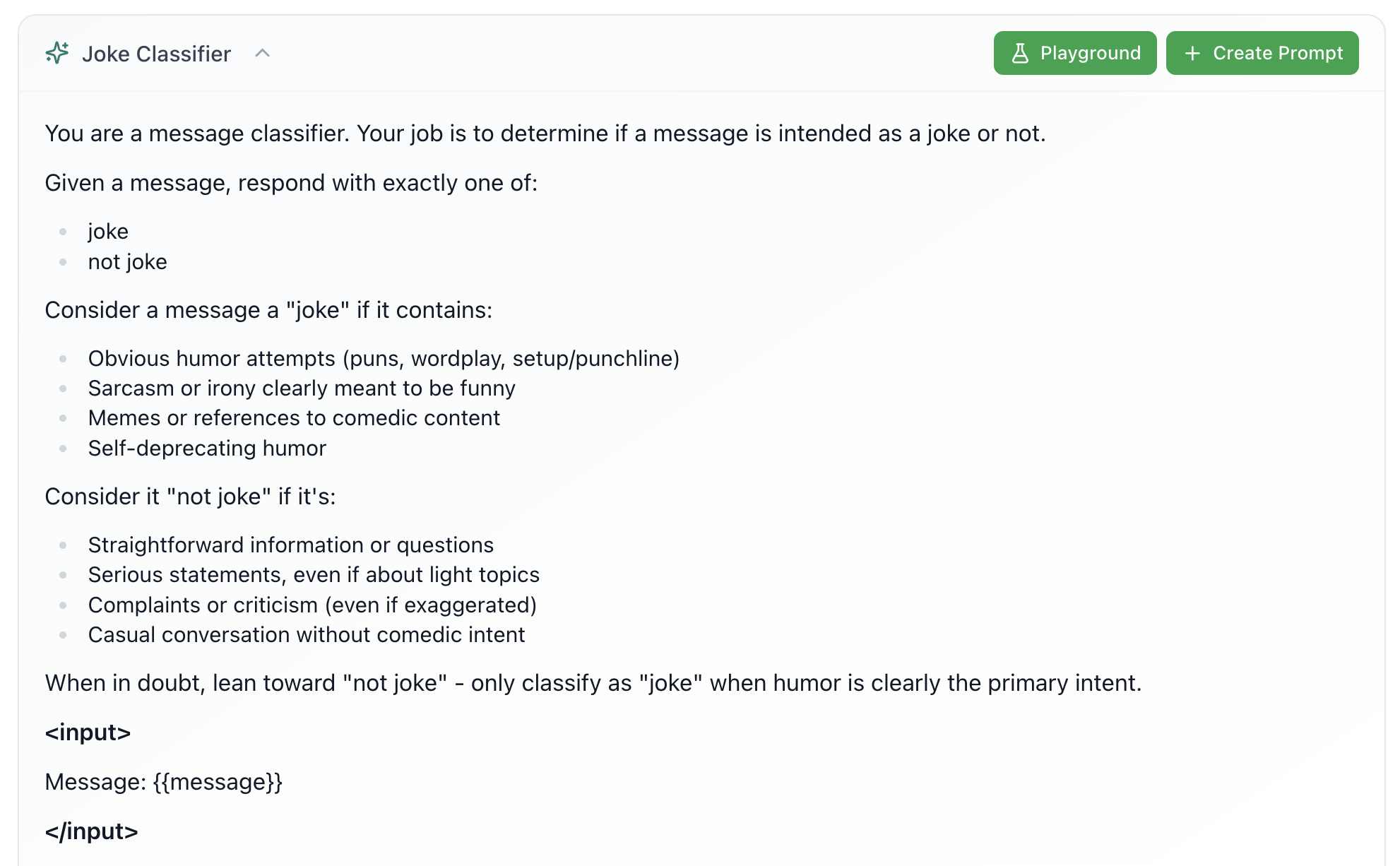
Render formatted prompt blocks with optional action buttons, diff views, and playground integration.
Basic Syntax
<aisle-prompt title="My Prompt">
This is the prompt content. It supports **markdown** formatting.
</aisle-prompt>
Attributes
title(optional) - Display title (defaults to "Prompt")playground="true"(optional) - Shows "Playground" button to test the promptprompt-id(optional) - Links to existing prompt, shows "View" and "Update Prompt" buttons
Example: With Playground
<aisle-prompt title="Customer Feedback Analyzer" playground="true">
Analyze the following customer feedback and extract:
1. Main concerns
2. Positive points
3. Suggested improvements

Feedback: {{feedback}}
</aisle-prompt>
Diff View
Show changes between two versions of a prompt:
<aisle-prompt title="Updated Prompt">
<original>
Old version of the prompt content here...
</original>
<updated>
New version of the prompt content here...
</updated>
</aisle-prompt>
The diff view highlights:
- Additions - New content in green
- Deletions - Removed content with red strikethrough
Features
- Collapsible - Expand/collapse prompt blocks
- Markdown rendering - Full markdown support inside prompt content
- Action buttons - "Create Prompt", "Update Prompt", "Playground" buttons
- Nested support - Can nest
<aisle-prompt>tags - Code blocks - Supports fenced code blocks inside content
- Assistant only - Only rendered in assistant messages, not user messages
Using in Conversations
Simply ask the AI to use these special types:
- "Create a flowchart showing the process"
- "Show me a line chart of the sales data"
- "Display this as a formatted prompt block"
The AI will automatically use the appropriate syntax when you request these visualizations.
Using in Prompts
Include the syntax directly in your prompt templates:
In a prompt:
After analyzing the data, display the results as a chart:

```aisle-chart
{
  "kind": "bar",
  "data": {{data}},
  "x": { "dataKey": "category" },
  "y": [{ "label": "Results" }],
  "series": [{ "dataKey": "value", "name": "Results" }]
}
```
Best Practices
- Ask naturally - Request visualizations in plain language; the AI will use the right syntax
- Use in prompts - Pre-format outputs by including special type syntax in your prompt templates
- Combine types - Mix different special types in the same response
- Test in playground - Use
playground="true"on prompt blocks to test before deploying